How can colour be used to communicate harmonic movement?
This is a question that a lot of my creative practice centres around. Now, if you read that question and instantly thought of Synaesthesia (a condition where people see colours corresponding with sound or pitch) popped into your head, please remove it. With this question, I do not intend to attach notes to colours, but to explore how colour can be used to communicate musical relationships.
If we think about musical harmony, at its elementary level, it is one pitch played against another, creating an interval. A musical interval is the sonic distance between two pitches. Within Western musical practice, we give them names such as octave, perfect 5th, tritone, etc., but at the elemental level, they are just sonic distances. The comparison and distance create musical context that can lead to a succession of other intervals, creating a harmonic progression. Colour works the same way: we create colour combinations and palettes by pairing one colour with another to provide visual context. Depending on their context, colours will take on different qualities. So, we have a system of musical intervals that create sonic distance, and colour combinations that create visual distance…. This is where I will restate my question:
Can colour be used to communicate harmonic movement?
1. The Sonicised Visual Palette

For this system, I will create a visual colour scale based on Johannes Itten’s Farbkreis, the 12-hue colour wheel commonly used in colour theory today. Arranged in the order above, the steps between colours form a visual chromatic progression similar to that of a musical scale. When creating his colour wheel, Itten stated that he did not see it as beneficial to make colour wheels that contain more than twelve hues. His argument was that the visual distance between the colours was not sufficient to clearly determine their relationships (reference). Because of this, we will not delve into microtonality and will stick to the chromatic, 12-hue progression to ensure that distinctions between colours are clear and easy to understand.
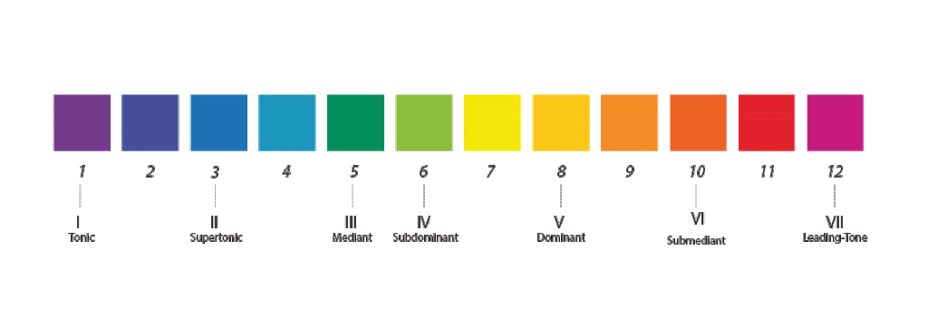
Each colour serves as a step in the chromatic scale, progressing from one hue to the next, creating a sense of motion. From this, a musical octave can be mapped onto the ‘colour octave’. We can then identify diatonic tonal functions and, therefore, recognise intervals, chords, and harmonic movement, visualising these tonal relationships through colour connections. These colour shifts are intentional, aimed at evoking tension and resolution, while reflecting ht edirectionality of (specifically) Western tonal harmony.
2. Theory Foundations
Let’s pause here to discuss some concepts I will use when discussing visual/harmonic progression, tension, and resolution.
The leading colour theorists whose work I will reference are Michel Eugène Chevreul, Josef Albers, and Johannes Itten. These prominent theorists draw on the concepts of contrast and enhancement in their work. They discuss in detail how placing different hues side by side can affect their appearance (Chevreul, 1967; Albers, 2022; Itten, 1992). Between them, seven forms of simultaneous contrast are mentioned:
1. Contrast of Hue
This form of colour contrast is strongest when colours are at their most intense, with the strongest contrast occurring between the three primary colours: red, yellow, and blue. The strength of the contrast diminishes as colours move further away from the primaries. Secondary colours, such as orange, green, and violet, create a weaker contrast, while tertiary colours create an even more subtle contrast.
2. Light-Dark Contrast
Light-Dark Contrast, as the term suggests, is the contrast created by differences in a colour’s lightness or darkness. When comparing two colours with similar levels of lightness, whether they are both light or both dark, there will be little contrast. However, placing a light colour next to a dark colour creates a much stronger and more dramatic visual contrast.
3. Cold-Warm Contrast
In colour theory, red-orange is considered the warmest colour, with other warm colours including yellow, yellow-orange, orange, red, and red-violet. Blue-green is considered the coldest, with other cold colours including yellow-green, green, blue, blue-violet, and violet.
When the two extremes, red-orange and blue-green, are placed next to each other, each colour’s perceived warmth or coolness is emphasised. Similarly, when warm colours are placed next to one another, their warmth becomes more prominent, while the same applies to cold colours. However, the perception of warmth or coolness can also be altered depending on the surrounding colour. For example, if red-violet is placed next to blue, it appears colder; when placed next to orange, it appears warmer. This is because red-violet shares a ratio of blue, and orange shares a ratio of red. When placed next to these common shades, the corresponding perceptual warmth or coolness is increased.
4. Complementary Enhancement
Complementary enhancement occurs when two complementary colours, two colours positioned opposite each other on the colour wheel, are placed side by side. For example, when blue and orange are placed next to each other, each colour emphasises the other, making both appear more vivid and intense. Although complementary colours can appear to clash visually, their proximity actually heightens the perceived intensity of each colour.
(Chevreul, 1967; 49)
5. Simultaneous Contrast
This form of contrast is based on the idea that when we see a colour, the eye simultaneously generates a tendency towards its complementary colour. This complementary colour is experienced perceptually, even though it is not physically present in what we are viewing.
For example, if an orange square contained a smaller neutral grey square in its centre, the grey would appear to take on qualities of blue, orange’s complementary colour. If the surrounding square were red, the grey would instead appear to take on a green quality. The effect is therefore created by the surrounding colour influencing how the neutral colour is perceived.
6. Contrast of Saturation
Contrast of Saturation compares the intensity, or brilliance, of a hue. If a highly saturated yellow is placed next to a yellow that has been diluted with grey, this creates a strong contrast of saturation. However, if two yellows are both diluted with grey, even if they contain different levels, the contrast will be less dramatic. The greater the difference in saturation between the two colours, the stronger the contrast.
7. Contrast of Extension
Contrast of Extension is the contrast created by the amount of surface area occupied by one colour in relation to another. If two colours occupy an equal amount of surface area, their visual weight is balanced. However, when one colour occupies significantly more space than the other, the difference in proportion creates a stronger contrast. The colour occupying the smaller area can appear more intense as a result of its relationship to the larger area of colour.
(Itten, 1992, pp. 33-63)
Visual Context
Both Albers and Itten were influential figures at the Bauhaus school. Albers, renowned for his book Interaction of Colour, shared his strong belief in the importance of context in colour perception. He argued that colours are never seen in isolation; instead, we always perceive them in relation to others. There is an undeniable similarity to ideas surrounding harmony in music. I will use these ideas on the interconnected nature of colour perception to communicate the connections and context of musical harmony.
Hearing music depends on the recognition of the in-between of the tones, of their placing and of their spacing […] we are able to hear a single tone, but we almost never see a single colour unconnected and unrelated to the other colours […] colours present themselves in continuous flux, constantly related to changing neighbours and conditions
(Albers, 2022, p.5).
Following Alber’s approach, Itten emphasised the importance of understanding colour through context. To identify these, he outlined the seven key contrasts discussed above. To structure and chart these relationships, he created the 12-hue colour wheel, which is still commonly used today. It incorporates primary, secondary, and tertiary colour levels into a structured diagram to help analyse their relationships (Itten, 1992, p.31).

Johannes Itten
(Fouché, 2017)
3. Back to the Palette
Now that we have a basic understanding of colour contrast and enhancement, let’s get back to discussing the musical-colour relationships of the palette. As shown in section one, chromatic and diatonic degree functions have been mapped onto the colour scale. A transition from Red-Violet to Violet can represent the movement of a Leading Tone to Tonic. This creates a warm-warm colour contrast, resulting in a heightened visual effect compared to other, more neutral colour combinations. While a more distinct shift from Yellow-Orange to Violet, almost complementary contrast, can illustrate the change from Dominant to Tonic, highlighting tension and resolution.
Meaning in music arises through movement – as one pitch follows another, we start to perceive intervals, tension, and resolution. A single letter has little meaning until combined with others to form a recognisable word. Similarly, an isolated tone in music has limited significance. A solitary C lacks context, but when followed by a G and then returned to, it creates a I-V-I progression, establishing a Tonic-Dominant relationship our ears recognise. Although a simple example, it supports the core analogy of this system; like sound, colour rarely exists alone. It is always experienced in relation to other colours, continually shifting and evolving within its context.
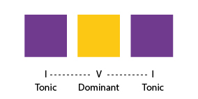
The design of this visualised musical context is crafted through individual colours that play a spatial role. Just as pitch degrees in a diatonic scale have specific harmonic functions – Tonic, Dominant, Sub-Mediant, etc. – the colours in this palette can visually represent those roles and sonic distances. A key idea here is that no colour corresponds to a particular pitch. Instead, each colour is linked to a chromatic degree and, consequently, to a diatonic function. As stated in our brief foray into colour theory, no colour is experienced in isolation; in the same way that no pitch can form meaning without the contextualisation of another pitch preceding or following it.
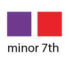
This arrangement has been designed to allow viewers to perceive colours contextually, influenced by those that precede and follow, and through transitions observed by comparing one colour to the previous and subsequent. This movement between colours forms a visual representation, in which the distance can be directly mapped to musical intervals, such as major/minor thirds and perfect fifths. Transitions that are closer represent a smaller musical step and a closer intervallic relationship; more distant relationships between hues represent a larger intervallic space.










Sources
Albers, Josef. Interaction of Color. 50th Anniversary Edition (New Haven, Connecticut: Yale University Press, 2022)
Chevreul, M. E, and Faber Birren. The Principles of Harmony and Contrast of Colors and Their Applications to the Arts (New York: Reinhold Pub. Corp., 1967)
Fouché, Edouard. “The Extended Color Wheel by Itten.” July 5, 2017. https://edouardfouche.com/The-Extended-Color-Wheel-by-Itten/
Itten, Johannes, and Faber Birren. The Elements of Color : A Treatise on the Color System of Johannes Itten Based on His Book The Art of Color (London: Chapman & Hall, 1991)


Leave a comment